Client: Myself
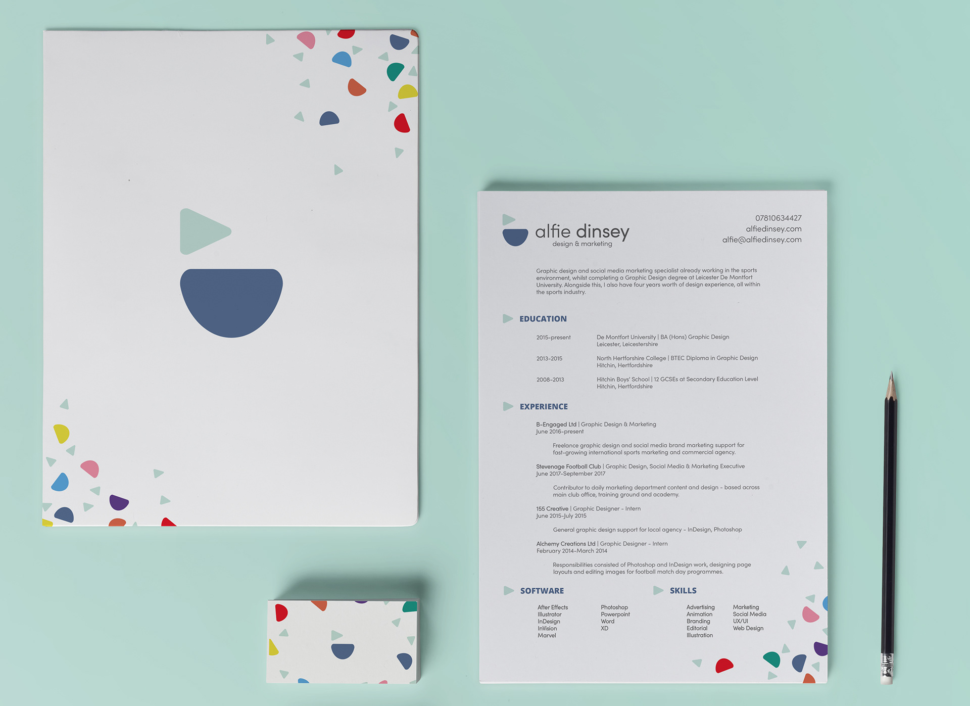
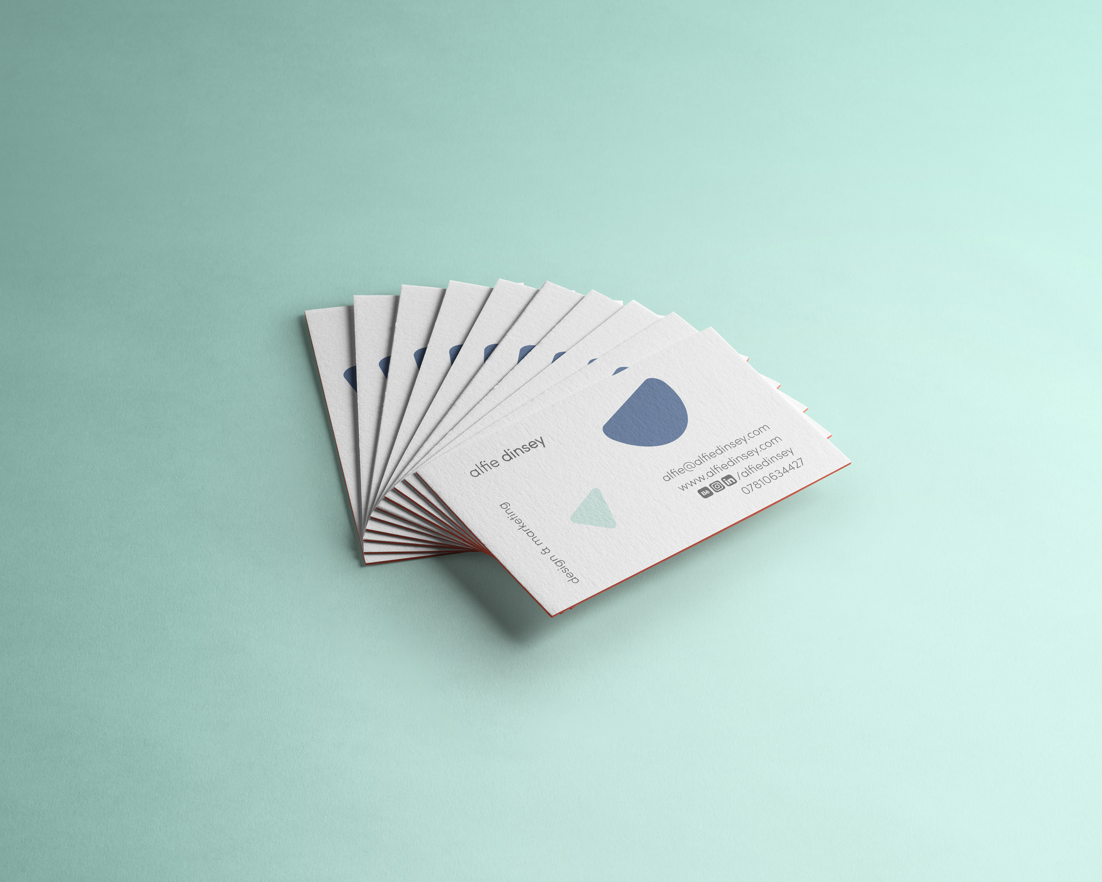
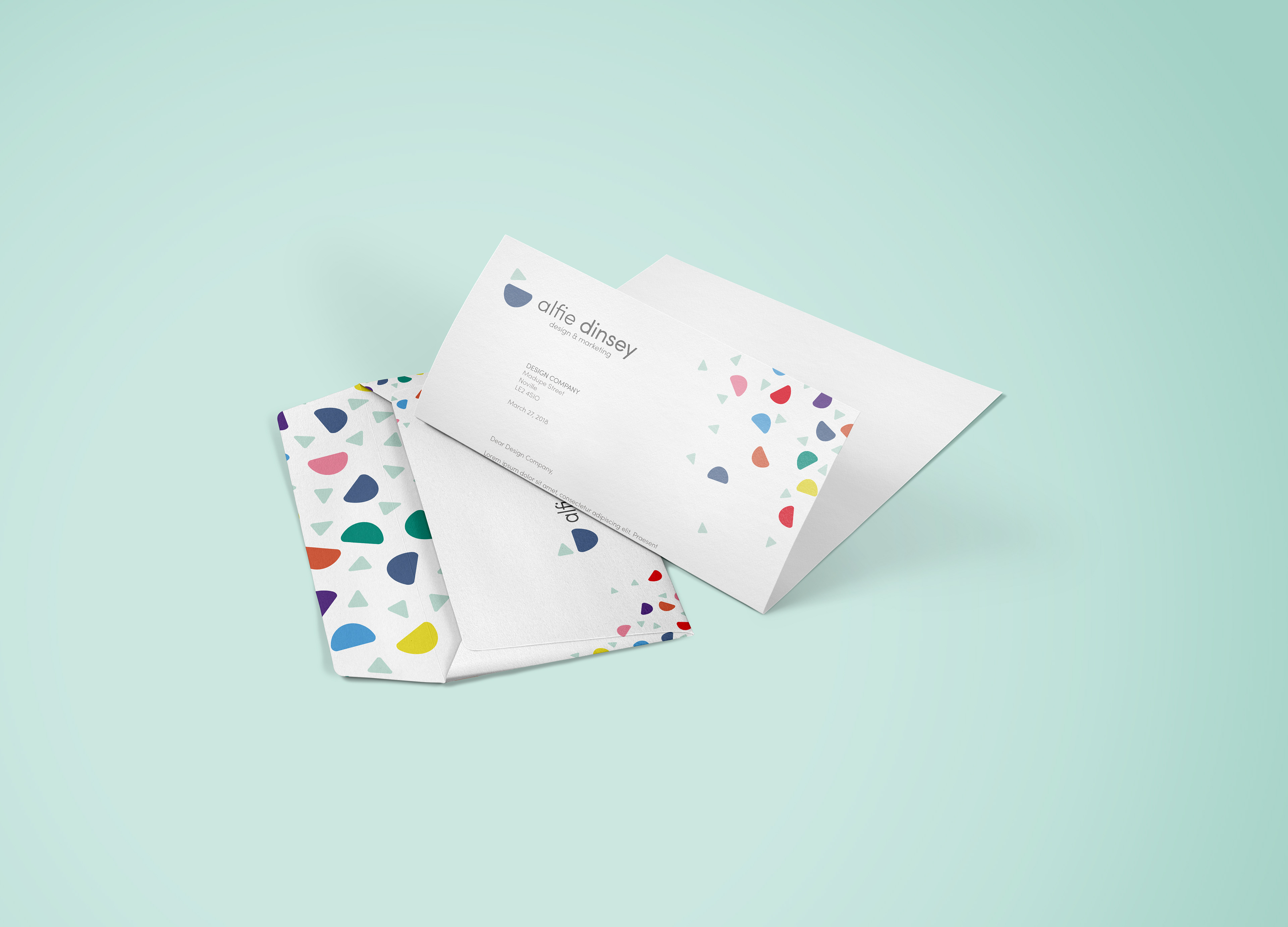
As a requirement for my Personal Professional Preparation module, we were required to develop our own personal brand and corresponding collaterals, including a logo, business cards, portfolio, and a website.
The concept of my personal branding was to keep it clean and precise, yet at the same time to not take itself so seriously.

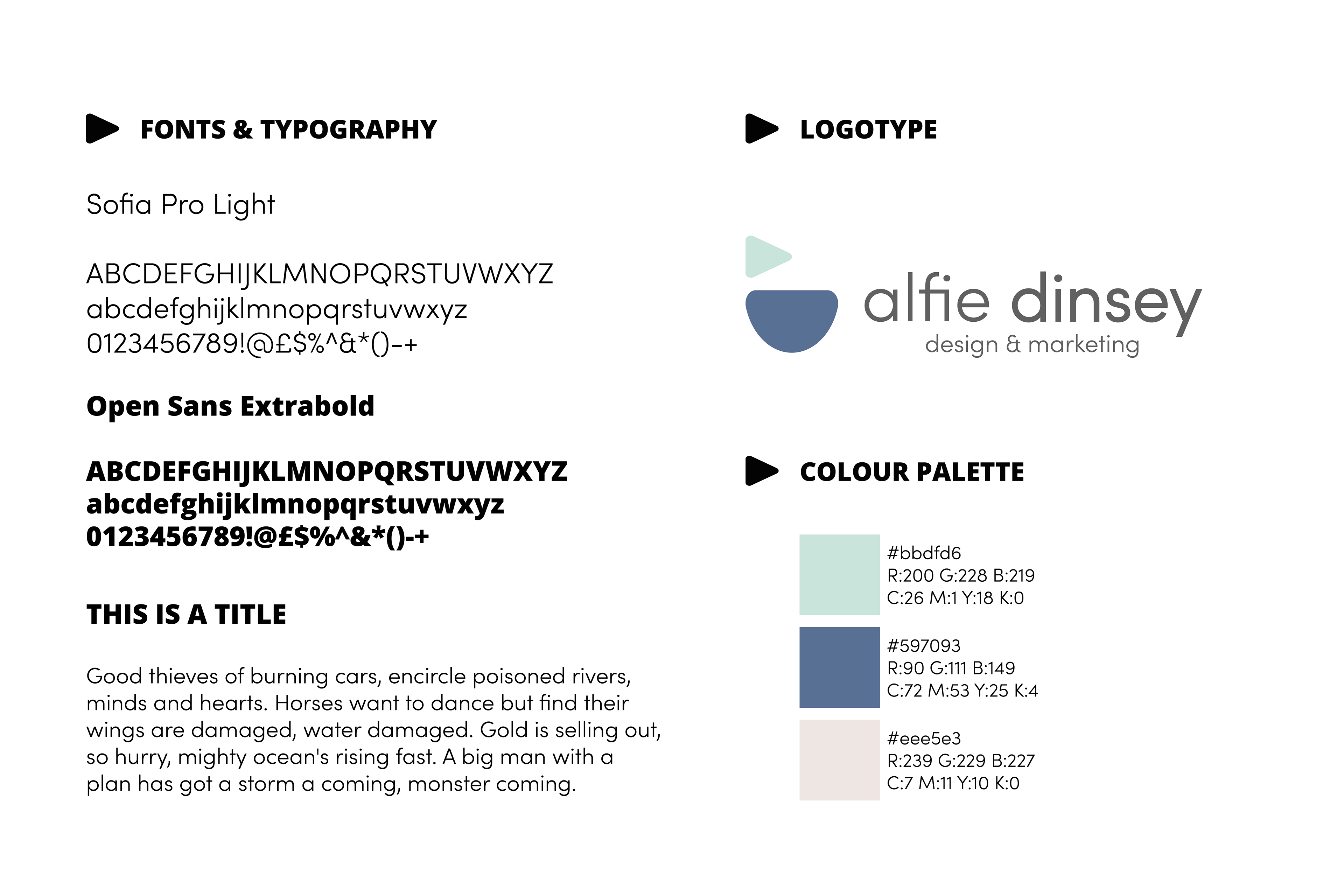
I wanted the logo to stay minimalistic but still represent my personality. The winky face idea came from turning the letters AD on their side, to combine type with shape and create quite a cheeky looking icon.
For the font, I used Sofia Pro Light because it's simple and friendly.
talk about teng here